The shift to mobile viewing is undeniable. With over 75% of global video watched vertically (TikTok, Instagram Reels, YouTube Shorts), editing for the 9:16 aspect ratio isn’t optional – it’s essential. Here’s your definitive guide to vertical video editing standards, composition, and typography for maximum mobile impact.
I. Foundational Technical Standards
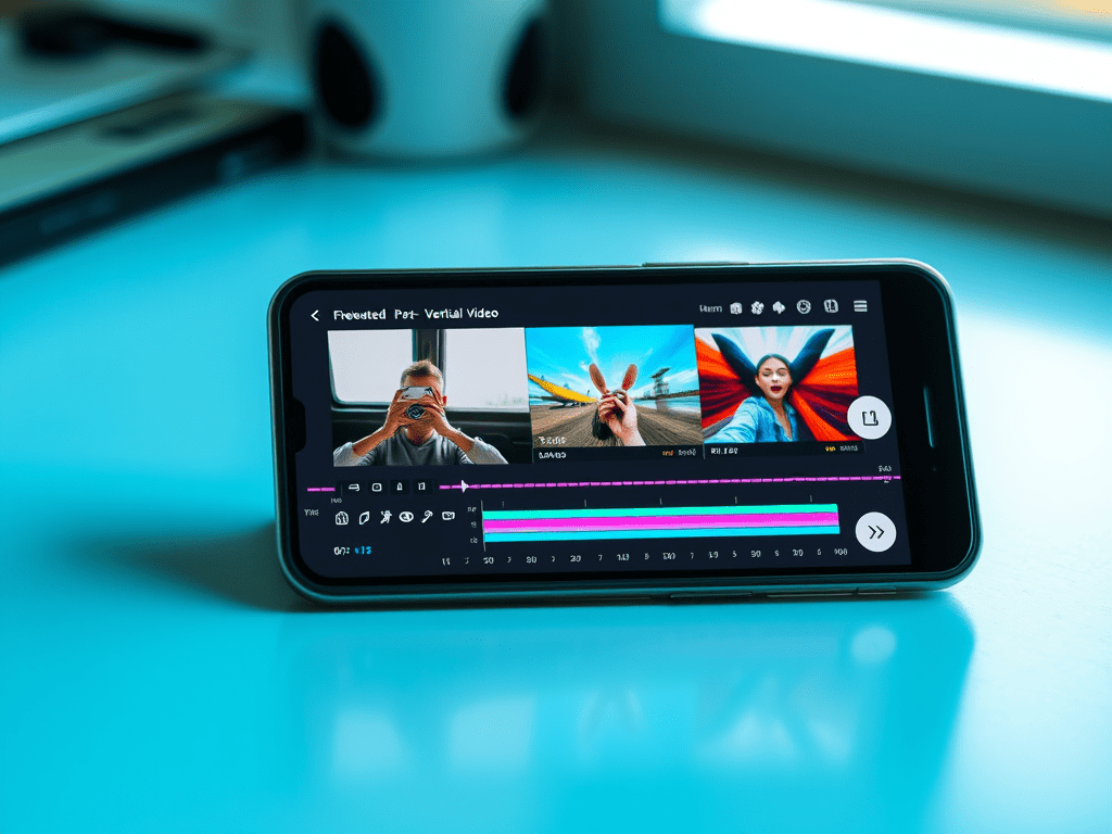
- Aspect Ratio: 9:16 (1080x1920px) is the non-negotiable standard. Deliver in this resolution.
- Resolution: 1080x1920px (Full HD Vertical) is ideal. 720x1280px is acceptable for very fast-paced social content.
- Frame Rate: Match platform standards: 24fps, 30fps, or 60fps (for high-motion content). Stay consistent.
- Audio: Prioritize clear dialogue. Optimize for phone speakers (test on device!). -6dB LUFS is common loudness target for social.
- File Format: MP4 (H.264) remains safest for compatibility. H.265 for smaller files (ensure platform support).
II. Mobile-First Composition: Framing for Thumb-Scrollers
Forget horizontal rules. Vertical framing demands new techniques:
- The Safe Zone / Critical Area:
- Center-Centric: Position key subjects & text in the central 60% of the frame. Avoid top/bottom 20% (covered by UI/captions/thumbs).
- Eye-Level Shots: Frame subjects looking slightly above center (where viewer’s eyes naturally rest).
- Avoid Extreme Edges: Logos, text, or vital action near edges get cropped or obscured.
- Framing Subjects:
- Tighter Shots: Medium shots (waist-up) and close-ups dominate. Wide shots lose impact.
- Single Subject Focus: Works best. For 2 people: Stack vertically (one slightly higher/lower) or use split-screen.
- Negative Space: Use strategically above/below subject, not sides. Creates breathing room.
- Movement & Action:
- Vertical Movement: Panning up/down feels natural (e.g., revealing a product). Limit horizontal pans.
- Dynamic Angles: Dutch tilts, overhead shots (“POV”), and low angles add energy within the vertical frame.
- Transitions: Vertical wipes, slides, zooms align with scrolling behavior. Avoid complex horizontal transitions.
III. Text & Graphics: Readability is King
Text overload kills vertical engagement. Design for instant comprehension:
- Typography Rules:
- Large & Bold: Fonts must be readable on small screens. Sans-serif only (Arial, Helvetica, Impact). Minimum 60pt for headlines.
- High Contrast: White text on dark semi-transparent background (or vice versa). Avoid busy backgrounds behind text.
- Minimal Words: 1-2 short lines max. Be brutal with editing.
- Placement Hierarchy:
- Headline: Top 1/3 (below platform UI).
- Key Info/Branding: Central safe zone.
- CTAs/Handles: Bottom 1/3 (above app UI).
- On-Screen Duration: Display text long enough to read twice (3-5+ seconds).
- Lower Thirds & Titles:
- Vertical Alignment: Stack name/title vertically.
- Simplified Design: Minimal boxes, thin lines. Ample padding.
- Animated Text: Subtle entrance/exit animations (fade, slide up/down). Avoid distracting effects.
- Graphics & Overlays:
- Scale Up: Icons, emojis, and graphics need larger sizes.
- Animated Elements: Use motion to guide the eye vertically (e.g., arrows pointing down).
- Progress Bars/Countdowns: Place at the very top or bottom edge.
IV. Platform-Specific Nuances
- TikTok / Instagram Reels:
- Hook in First 0.5 Seconds: Visual surprise or text question.
- Leverage Native Features: Templates, text-to-speech, stickers, effects.
- Captions are Mandatory: Burn-in open captions (styled correctly) or use platform’s CC tools.
- Trend-Driven Editing: Fast cuts, zooms, synced sound.
- YouTube Shorts:
- Slightly Longer Attention: Can sustain 15-30s narratives better.
- Brand Consistency: Maintain channel identity within vertical format.
- End Screens: Utilize “Remix” features and vertical end screens.
- Stories (Instagram/FB/Snapchat):
- Ultra-Short Segments: Design for 1-3s per “slide.”
- Interactive Elements: Polls, Q&A stickers, swipe-ups.
- Full-Bleed Design: Utilize entire 9:16 frame (aware of safe zones).
V. Common Pitfalls & Pro Solutions
- Pitfall: Cropping horizontal footage poorly.
- Solution: Reframe natively in 9:16. Use auto-reframe tools (Premiere Pro, DaVinci Resolve) cautiously + manual adjustment.
- Pitfall: Text overload or poor placement.
- Solution: Follow the 1-2 line rule. Use text presets designed for 9:16. Test on phone!
- Pitfall: Ignoring platform UI elements.
- Solution: Use platform-safe zone templates (download from Canva or official sources). Always preview on app.
- Pitfall: Slow pacing.
- Solution: Tighten edits ruthlessly. Aim for 1-2s average shot length for Reels/TikTok.
- Pitfall: Unoptimized audio.
- Solution: Use loudness meters. Prioritize voice clarity. Add captions.
VI. Essential Vertical Editing Tools
- Adobe Premiere Pro: Auto Reframe, Essential Graphics MOGRTs for vertical text.
- DaVinci Resolve: Magic Mask, vertical timeline presets, Fusion for vertical motion graphics.
- CapCut: Built-in vertical templates, effects, and AI tools optimized for social.
- Canva / Adobe Express: Quick vertical templates for graphics/text overlays.
- InShot / Splice: Powerful mobile editing apps for on-the-go vertical edits.
Conclusion: Design for the Scroll
Vertical video isn’t just a rotated format – it’s a distinct visual language. Success requires embracing mobile-first composition (safe zones, tight framing, vertical movement), ultra-readable text design, and platform-specific optimization. By mastering these standards and constantly testing your edits on actual devices, you create thumb-stopping content that thrives in the 9:16 world. Remember: In vertical editing, less is more, clarity is king, and the first second is prime real estate. Now go own the feed!
 Wonder-Ware
Leave a comment