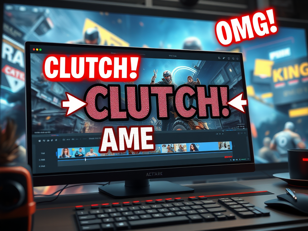
In the crowded world of gaming content, your incredible plays and hilarious moments need to stand out. While raw footage can be impressive, it’s often the simple addition of text and titles that transforms a good clip into a great, engaging video. Text overlays are powerful tools that guide your audience, emphasize key moments, and inject personality into your edits.
The good news? You don’t need to be a professional video editor to use them effectively. Here’s a guide to simple text overlay techniques that will instantly level up your game videos.
Why Bother with Text? The Key Benefits
Before diving into the “how,” it’s important to understand the “why”:
- Highlight Key Moments: Draw the viewer’s eye directly to the action. A well-timed “CLUTCH!” or “OMG!” during an incredible play amplifies the excitement and tells the audience, “This is the part you can’t miss!”
- Explain and Inform: Use text to clarify what’s happening. Explain a complex strategy, identify an enemy, or add context that your voiceover might not cover. Arrows and short notes are perfect for tutorial-style content.
- Add Humor and Personality: Text is a fantastic vehicle for comedy. Use it to display a character’s internal monologue, add a sarcastic comment, or create a meme-like effect that resonates with your viewers.
- Compensate for a Lack of Commentary: If you’re not comfortable recording your voice, text can serve as your primary narration, guiding the viewer through the story of your gameplay.
Simple Techniques to Implement Today
You can achieve fantastic results with basic editing software like CapCut, DaVinci Resolve, or even the editor built into YouTube Studio. Here’s how to get started:
1. The Basic Title & Lower Third
- What it is: This is your standard text. A Title is typically larger and used at the beginning of a video or a new segment. A Lower Third is a smaller text or graphic that appears in the lower portion of the screen, often used to introduce a player, weapon, or location.
- How to use it:
- Keep it brief. Nobody wants to read a paragraph.
- Choose readable fonts. Avoid overly fancy, script-heavy fonts. Sans-serif fonts (like Arial, Helvetica) are usually the most readable on screen.
- Use a contrasting color or outline. White text with a black outline or drop shadow can be read on any background, light or dark. This is crucial for gameplay where the scene changes constantly.
2. The Dynamic “Pop-Up” Text
- What it is: Text that doesn’t just sit there—it animates in and out. Think of words that “pop” onto the screen to emphasize a hit, a dodge, or a discovery.
- How to use it:
- Sync it with the action. The text should appear exactly on the beat of the action or the soundtrack.
- Use simple animations. Most editing software has preset animations like “Fade,” “Pop,” “Slide In,” or “Typewriter.” A little movement goes a long way.
- Scale for impact. Make the text grow slightly as it appears to give it a feeling of power and importance.
3. The Reaction & Thought Bubble
- What it is: Text that represents what you (or your character) are thinking in a specific moment. This is one of the easiest ways to add humor.
- How to use it:
- Place it near the subject. Usually, this means placing the text near your game character’s head.
- Use a different style. A bubbly, handwritten, or italicized font can help sell the idea that this is an internal thought.
- Keep it relatable. Use reactions your audience would have (“Wait, what?!” “Nope! Nope! Nope!”).
4. Labels and Arrows
- What it is: Pure, functional text used to point things out.
- How to use it:
- Be direct. Use arrows, circles, or highlights to direct the viewer’s gaze.
- Use a consistent color scheme. Maybe all your labels are yellow with bold text. Consistency makes your videos look more professional.
Pro Tips for Maximum Effect
- Less is More: Don’t clutter the screen. Use text strategically to enhance, not overwhelm, the gameplay.
- Consistency is Key: Develop a style and stick to it! Using the same 2-3 fonts, colors, and animation styles across your videos helps build your brand and makes your content instantly recognizable.
- Timing and Duration: Leave text on screen long enough to be read comfortably—usually 2-4 seconds for a short phrase—but not so long that it overstays its welcome.
Conclusion
Adding text and titles is one of the simplest and most impactful edits you can make to your gaming videos. It bridges the gap between you and your viewer, ensuring they see what you see and feel what you feel. By mastering these basic techniques, you’ll create more dynamic, entertaining, and professional-looking content that keeps your audience hooked from start to finish.
Now, fire up your editor and start adding those highlights

Leave a comment